Layout Questions or Comments?

Layout

v1.0.0-beta.1

A set of standards and guidelines for laying out pages.

Usage Guidelines

All pages should try to follow the guidance of this component for laying out their contents. Ultimately the underlying grid is really the only strict rule, the rest of the component simply gives you a toolset of common layouts but don’t feel too constrained by them.

Features

  • Includes standard breakpoints
  • Handy 12 column grid that can support many layouts
  • Guidance on standard layouts and how to communicate with developers

Dependencies

breakpoints@^1.0.0

Grid Structure

Every page layout should fit into and utilize the common grid strategy.

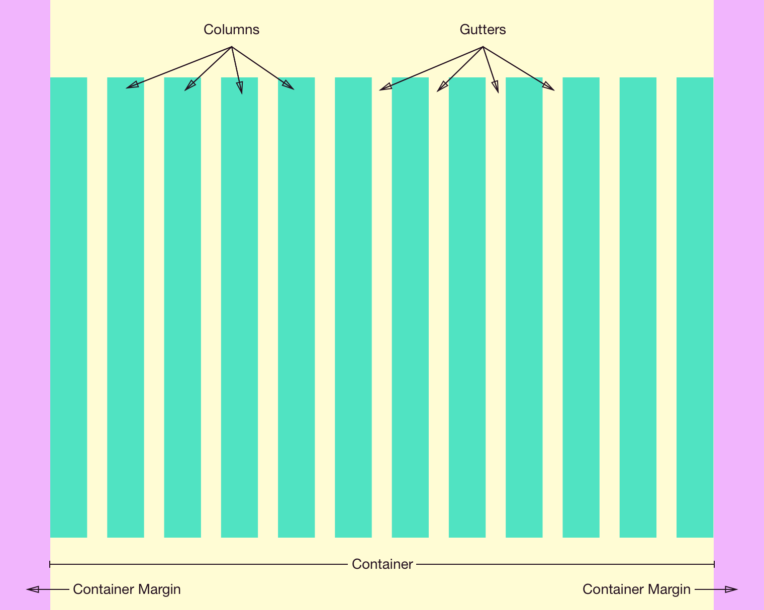
The grid consists of several key parts that include the Container, Container Margins, Columns, and Gutters.

All columns reside within the Container, which is located at the root level of a page. Depending on the breakpoint, the container will have Container Margins of various sizes. The container also has a maximum width property, beyond which only the container margins grow in size.

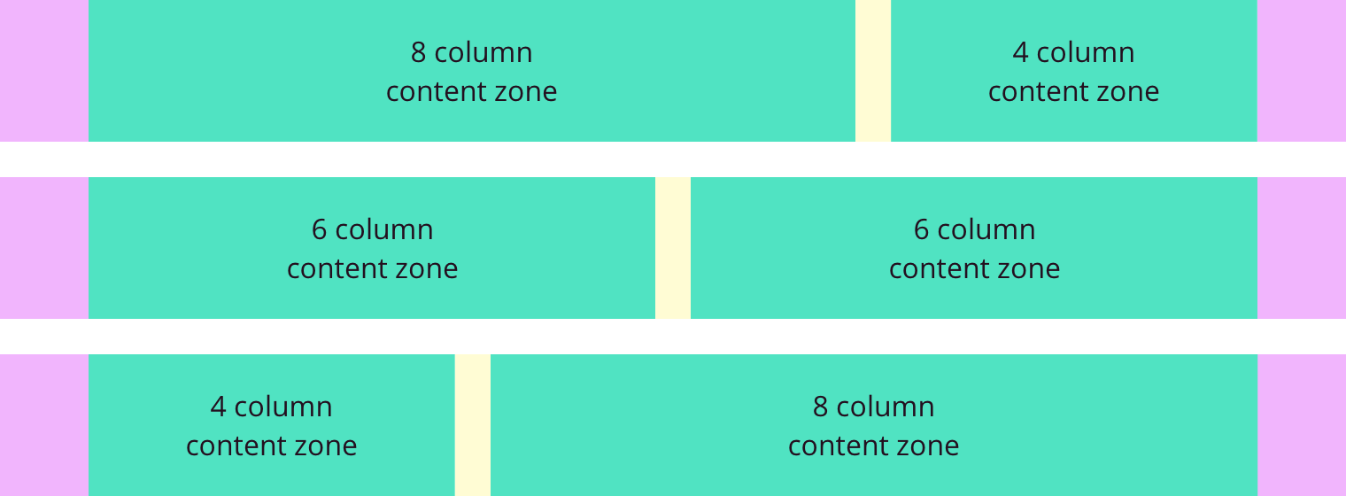
The container is divided into 12 proportional Columns which are used to size content and containers on the page. These are separated by Gutters of a fixed size (which varies based on the breakpoint again).

See the redlines for the exact dimensions of each feature at each breakpoint.

The key parts of the grid.

Breakpoints

All pages should provide full functionality and content regardless of screen size. There are five standard breakpoints which your layout should support. Your layout can only change at these breakpoints and should use the shape of your content to decide how to adapt.

Size >= Min < Max
xs 320px 480px
sm 480px 768px
md 768px 1024px
lg 1024px 1280px
xl 1280px

Common Page Templates

Here are a few standard page templates which are broadly applicable. Treat these more like guidelines, follow them when it makes sense but feel free to create variations to support your specific use case.

Combining templates

For larger, more complicated pages multiple templates can be stacked vertically allowing you to customize the layout of each section to the actual content it contains.

Responsive behavior

A page layout should function at every standard breakpoint. You’ll probably need to switch between various templates at a certain width—use your content as a guide for when to change up the layout.

Single content zone

For pages that focus on a single set of content or controls it often makes sense to dedicate the full page width to that primary content.

Varying width

A single content zone typically takes up all 12 underlying grid columns, but it can also span 10 or even 8 columns depending on the actual content. Prefer to center the content zone in these cases.

Dual content zone

A dual zone template is common when you have multiple pieces of content to present at the same time. Split the page based on the underlying grid; common combinations include 8/4, 6/6, and 4/8.

Triple content zone

For situations where you have several items of similar importance a triple zone template can present them all with relatively equal visual importance. This typically takes the form of 4/4/4 underlying grid columns. Other combinations are possible but are generally discouraged as overly complicated.

Changelog

1.0.0-beta.1

Initial version.